Who We Are
What We Do
How We WorkCase StudiesBlogDoing GoodOur Services
We make marketing delightfully uncomplicated so that our partners gain improved clarity, direction, and peace of mind.
Strategize
Brand Strategy | Web Design & Development
December 22, 2025 | Jason Kanzler
For 35 years, the Foster & Adoptive Care Coalition has been doing some of the most important work in the St. Louis region—finding safe, loving homes for children who need them most. Their mission is simple and profound: every child deserves a place to call home.
When they came to us, their digital presence wasn't keeping pace with the impact they were making in the community. Three separate websites. Outdated design. A user experience that made it harder than it should be for foster parents, donors, and volunteers to engage with an organization doing genuinely life-changing work.
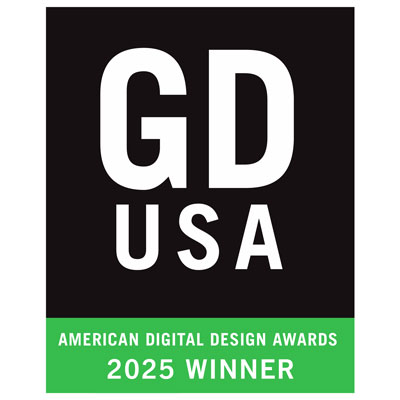
We set out to change that. And just a few months after launch, the new site has already earned a GDUSA American Web Design Award—recognition that the design community sees what we see: a website that finally matches the caliber of the mission behind it.
Nonprofit website design presents a unique challenge. Unlike a typical business site with a single conversion goal, organizations like the Coalition serve multiple distinct audiences, each with different needs and motivations:
Prospective foster and adoptive parents researching the process and trying to understand if this path is right for their family. Current foster families looking for resources, support, and community. Donors wanting to contribute financially to the mission. Volunteers ready to give their time. And families in crisis who need immediate help navigating the system.
The Coalition's previous web presence had evolved organically over the years, resulting in three separate websites: the main organizational site, a separate property for ReFresh (their program supporting foster families with essential items), and another for the Institute for Child Welfare and Innovation. Each site had its own navigation, its own design language, and its own maintenance burden.
The user experience was fragmented. Someone interested in fostering might visit one site, then have to navigate to an entirely different property to learn about the support resources available to them. Donors couldn't easily see the full scope of the organization's impact. The sites were heavy on stock photography and even heavier on orange—so much orange that the brand felt more overwhelming than warm.
Before we touched a single wireframe, we invested significant time understanding who actually uses this website and what they need from it. This is where brand strategy meets web design—you can't build an effective site without first understanding the humans who will use it.
We developed detailed user personas covering demographics, motivations, pain points, and decision-making processes. A prospective foster parent in their 30s researching the process for the first time has fundamentally different needs than a longtime donor checking in on the organization's latest initiatives. The site needed to serve both seamlessly.
The sitemap consolidation was strategic. Rather than simply combining three sites into one bloated property, we identified the core user journeys and built an information architecture that guides each audience to what they need without overwhelming them with everything else. ReFresh and the Institute became integrated sections within a unified experience—accessible when relevant, but not cluttering the path for users who don't need them.
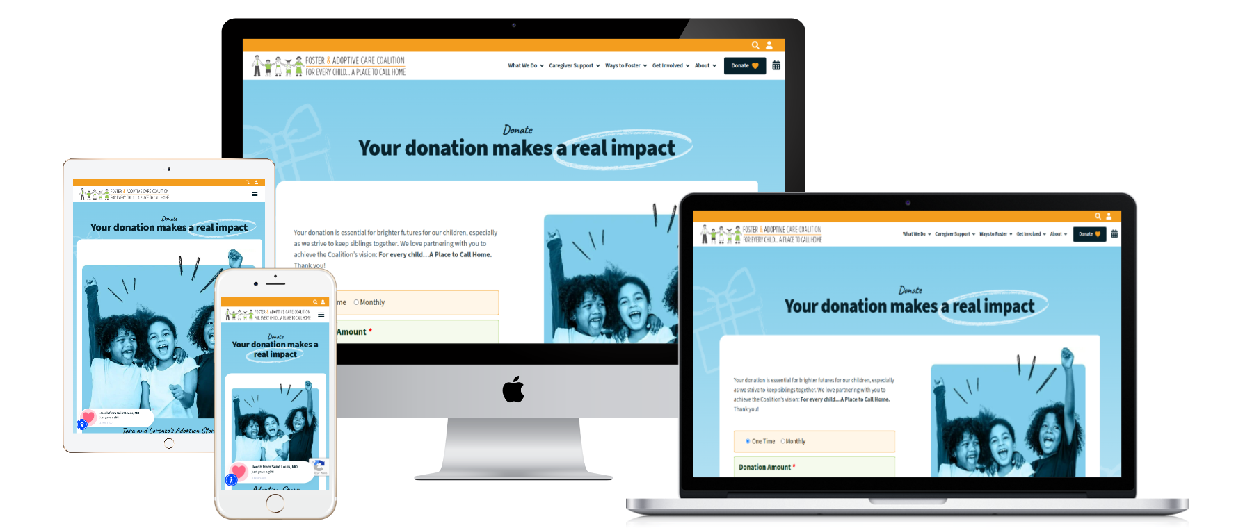
The visual transformation was dramatic. We moved away from the orange-heavy palette that had come to dominate the old sites, creating breathing room for the real stars of the show: the actual families and children the Coalition serves.
Stock photography gave way to authentic imagery. The new design is playful and lively—appropriate for an organization focused on children and families—but with a sophistication that reflects the serious, professional work happening behind the scenes. It's a design that says "we take our mission seriously" without feeling clinical or institutional.
The color palette, typography, and graphic elements all work together to create a cohesive brand experience. We developed a comprehensive digital style guide to ensure consistency as the organization continues to grow and evolve. This kind of brand foundation is what separates websites that age well from those that feel dated within a year.
Mobile responsiveness wasn't an afterthought—it was baked into every design decision. Foster parents researching resources at 11pm on their phones deserve the same quality experience as donors browsing on desktop during lunch.
A beautiful design means nothing if the site doesn't function flawlessly. The technical requirements for this project were substantial, and this is where our web development team really delivered.
The platform migration alone was significant—moving from an aging WP Bakery implementation to a modern, maintainable architecture that the Coalition's team can actually manage going forward. We built on WordPress with WP Engine hosting, giving them enterprise-grade performance and security appropriate for an organization handling sensitive family information.
The Salesforce integration was critical. The Coalition runs on Salesforce for their CRM, and the website needed to feed directly into those systems. Form submissions, donation processing, volunteer signups—all of it flows seamlessly into their existing operational infrastructure. This kind of integration isn't glamorous, but it's what transforms a website from a digital brochure into an actual business tool.
We also built custom functionality for their Little Wishes program, which provides essential items to children in foster care. This wasn't a typical e-commerce implementation. The goal wasn't to maximize transactions—it was to tell stories. Each item page emphasizes the child it will help, the impact of the gift, the human connection being made. We even built a stock reservation system to prevent the frustration of cart conflicts during high-traffic donation periods.
Accessibility compliance was non-negotiable. Children in the foster care system come from every background, and so do the families who want to help them. The site meets WCAG 2.1 guidelines, ensuring that users with disabilities can fully engage with the organization's mission.
The best measure of a project's success isn't the awards (though those are nice). It's whether the client feels like they finally have a digital presence that represents who they actually are.
The Coalition team's reaction said it all. They called the new site "both functional and AMAZINGLY beautiful." One team member said they finally have a website they can be "proud of." Another described the user experience as "transformative." And perhaps most meaningfully: "Grateful for your vision and partnership."
That word—transformative—captures exactly what we were going for. Not just a new coat of paint, but a fundamental shift in how the organization presents itself to the world and how users experience engaging with their mission.
Within weeks of the October 2025 launch, the Foster & Adoptive Care Coalition website was selected as a GDUSA American Web Design Award winner. This recognition from Graphic Design USA reflects what we believe about this project: that thoughtful strategy, human-centered design, and technical excellence can come together to create something genuinely special.
It's the kind of work we're proudest of at Seafoam—projects where the quality of the output matches the importance of the mission. Every child deserves a place to call home. And now, the organization fighting for that outcome has a digital home worthy of the work they do.
If your brand's website isn't keeping pace with your impact—or if you're a mission-driven organization whose digital presence doesn't reflect the quality of your work—we'd love to talk. This is exactly the kind of project that gets our team excited: complex challenges, meaningful missions, and the opportunity to build something that actually matters.
See the live site at foster-adopt.org — and when you're ready to talk about what your organization could become online, we hope you’ll reach out.