Porta-King
Keyword Dominance for The King
Porta-King building products offer a cost-friendly and convenient alternative to traditional construction. Proudly made in the U.S.A., Porta-King custom-designs modular offices, prefabricated security buildings, and more for a wide range of applications.
Based in Earth City, Missouri, this locally rooted company has a rich foundation underneath its feet dating all the way back to 1969. Over the course of five decades, Porta-King has established ten regional sales offices in the United States and two production facilities in Missouri totaling more than 152,000 square feet.
The Challenge —
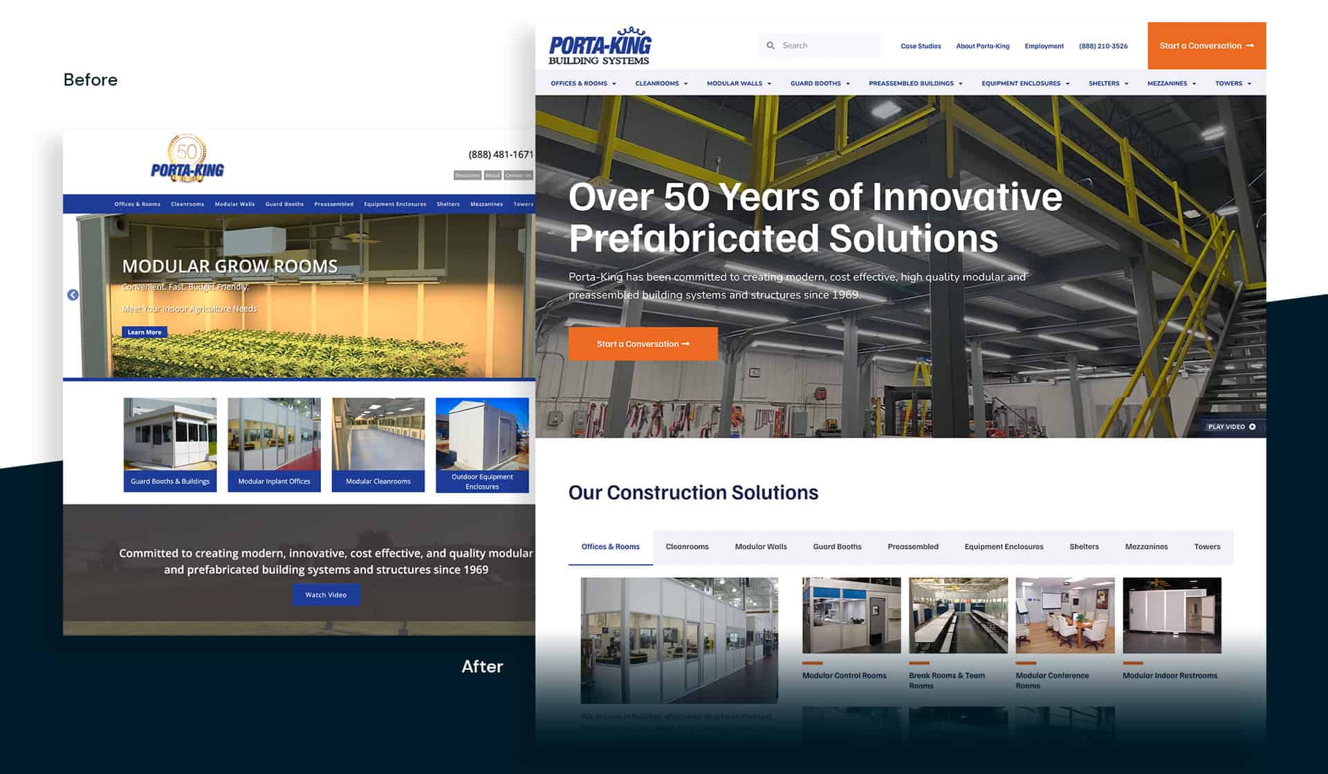
Although they’re a well-established company with a loyal fanbase, Porta-King had a marketing problem. Their existing website didn’t represent the quality and the reach that Porta-King was known for. While it conveyed important information, it wasn’t positioned well in search rankings so that new customers – and even existing customers – could easily find what they were looking for. Porta-King knew that to continue their pace of growth, their website had to match their mission. It needed an SEO makeover.
Unfortunately, Porta-King didn’t know this until their search engine rankings fell through the floor. The Seafoam team immediately went to work on reviving Porta-King’s rankings. As it turns out, the new Porta-King website, though visually sound, wasn’t fabricated for the modern web. It was missing key search terms that customers typically typed into Google when looking for Porta-King’s products. In addition, they weren’t running Google Ads to get the word out that their brand was still the supreme manufacturer and retailer in their industry.
To add even more fuel to the fire, Porta-King’s competitors were ranking for the search terms Porta-King should have been targeting, thus stealing away valuable online real estate.
The Approach & Solution —
As we designed a strategy for Porta-King, we knew we wanted to strike the right balance between informative web content and keyword dominance on Google. As we say in our office from time to time, we had to know how to speak to the “bots” that rank, as well as the humans that read. So we started to redefine the content throughout Porta-King’s site, trimming the pieces we didn’t need and sculpting what was left into an SEO masterpiece.
However, as satisfied as we were of our work, we also recognized that search engine optimization alone wasn’t going to be enough to give Porta-King the initial rankings bump they were hoping for. We’d need to use some well-placed ads to siphon a little online real estate back from Porta-King’s competitors and re-establish the brand amongst current and future customers. In order to do so, we started off small; building highly targeted and very specific campaigns in tandem with website changes to help amplify our efforts. We worked on getting the quality score of the brand up, before we put more money into the campaigns. Over time, we were able to expand on these campaigns, growing them into a consistent lead generation tool for the brand.
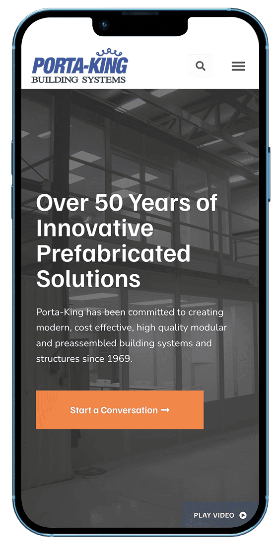
To tackle Porta-King's slow site speed and maintenance problems, we designed a slick new website from the ground up, utilizing a combination of custom PHP code and trusted WordPress plugins like Elementor, GeotargetingWP and Advanced Custom Fields.
To tackle Porta-King's slow site speed and maintenance problems, we designed a slick new website from the ground up, utilizing a combination of custom PHP code and trusted WordPress plugins like Elementor, GeotargetingWP and Advanced Custom Fields.
The Results —
40.73%
Increase in Traffic
51.34%
Increase in YoY PPC Traffic
148.37%
Increase in Online Conversions