WorldNet Solutions

A UX Glow-up for a Tech Contractor

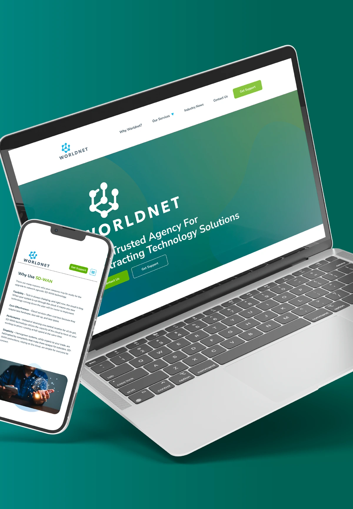
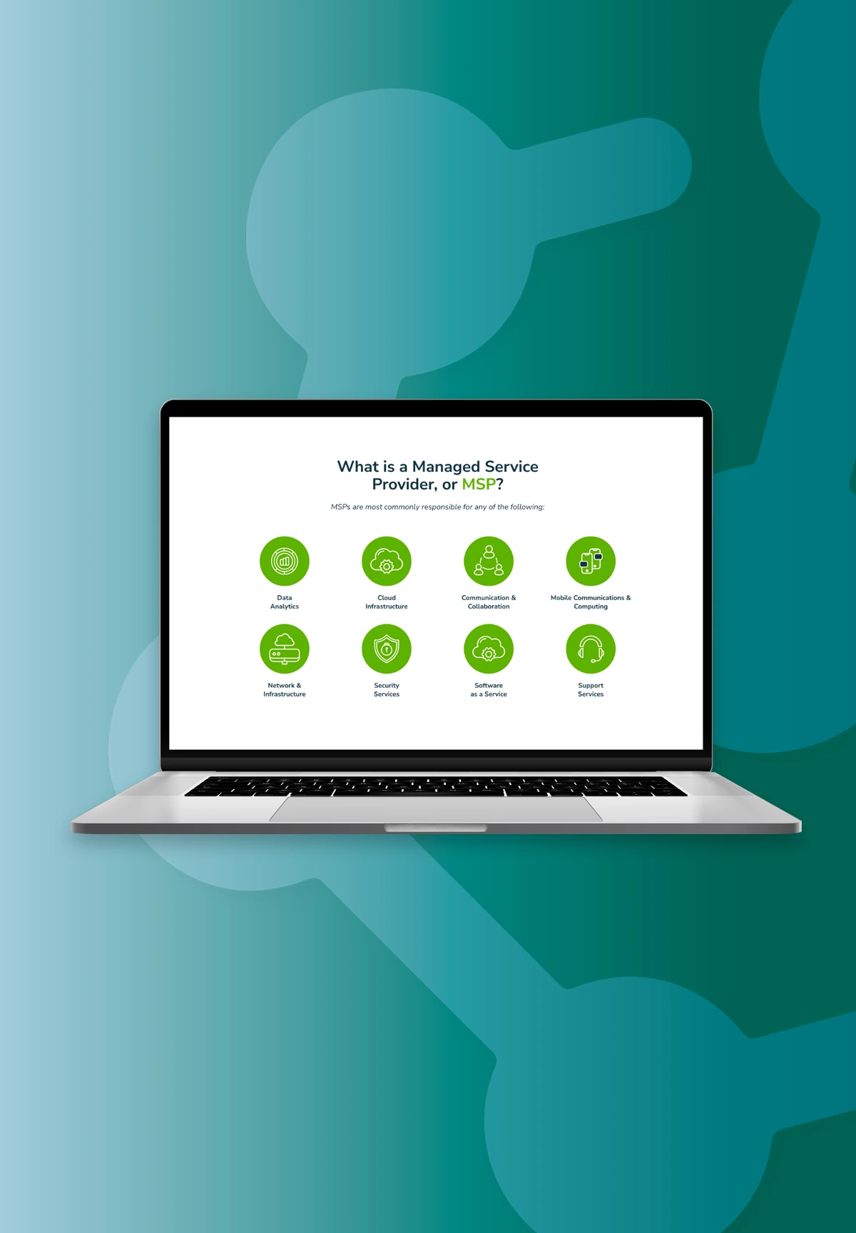
By partnering with Seafoam, WorldNet Solutions now has a website that not only effectively communicates its value proposition but also creates a memorable, user-centric experience. This strong digital foundation sets the stage for continued growth, customer acquisition, and long-term success in the competitive IT services landscape.

Worldnet Solutions provides genuine support when you need it most, eliminating the hassle and wasted time associated with service requests. No matter the problem, Worldnet ensures a quick resolution every time.

worldnet solutions logo
Abstract pattern with light green interconnected nodes and lines on a gradient teal background. Repeating geometric shapes create a modern, tech-inspired design.

The Challenge 

WorldNet Solutions, a leading provider of IT consulting, cybersecurity, and cloud services, approached Seafoam with a unique challenge. While they had recently refined the content on their service pages, the information was presented in a dense, text-heavy format that lacked visual appeal and user-friendliness. WorldNet Solutions sought a strategic partner to redesign their site, enhancing its modern aesthetic and user experience while preserving the value of their recently updated content.
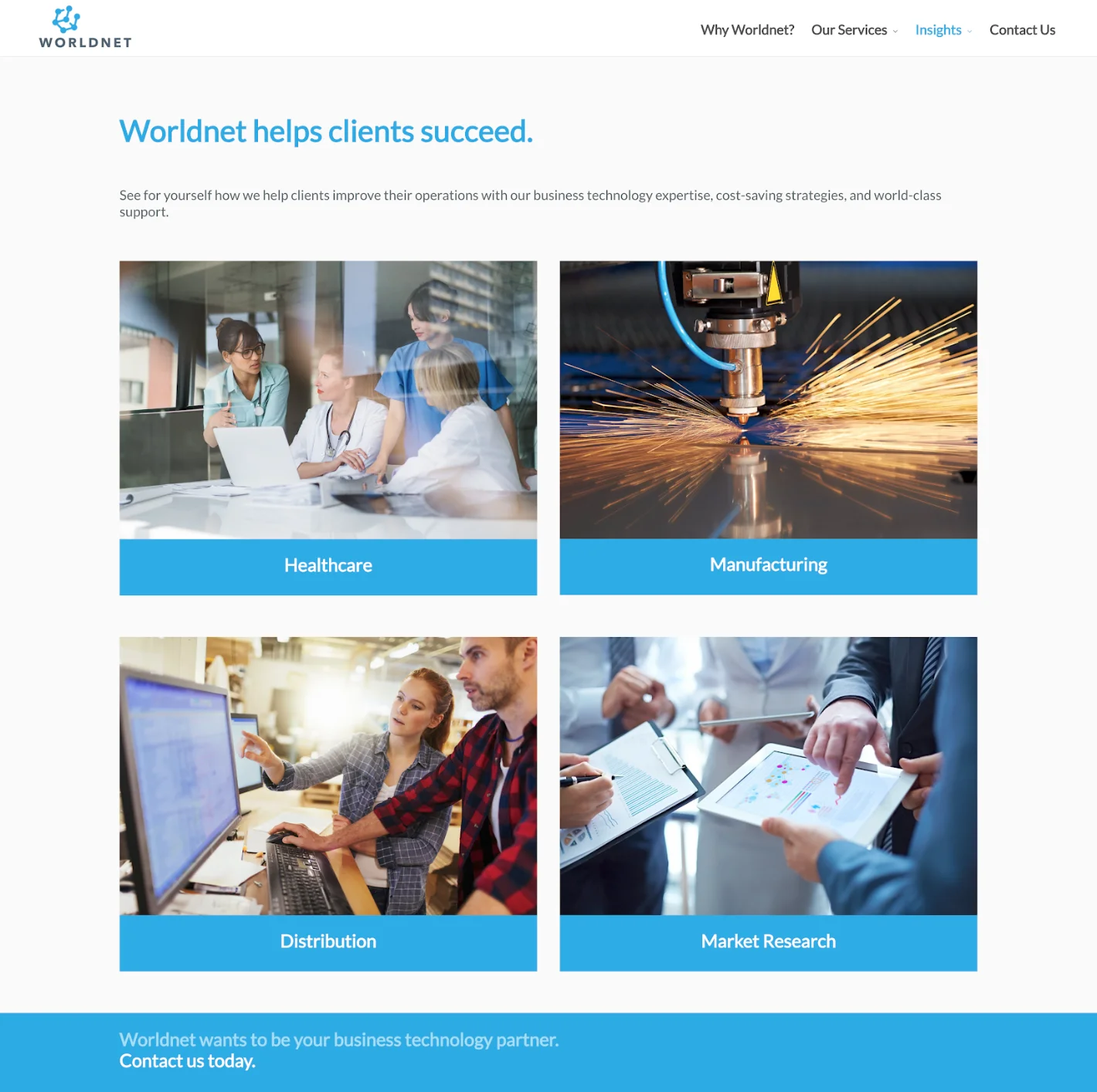
A flowchart on the left shows a structured website hierarchy with categories such as "Home," "Services," and "Why Workflows." On the right, a style guide displays fonts, colors, buttons, and icons for design consistency.
A laptop and smartphone displaying the WorldNet website, placed against a graphic background with interconnected blue nodes and lines. The website features technology solutions and a contact page image on the phone.

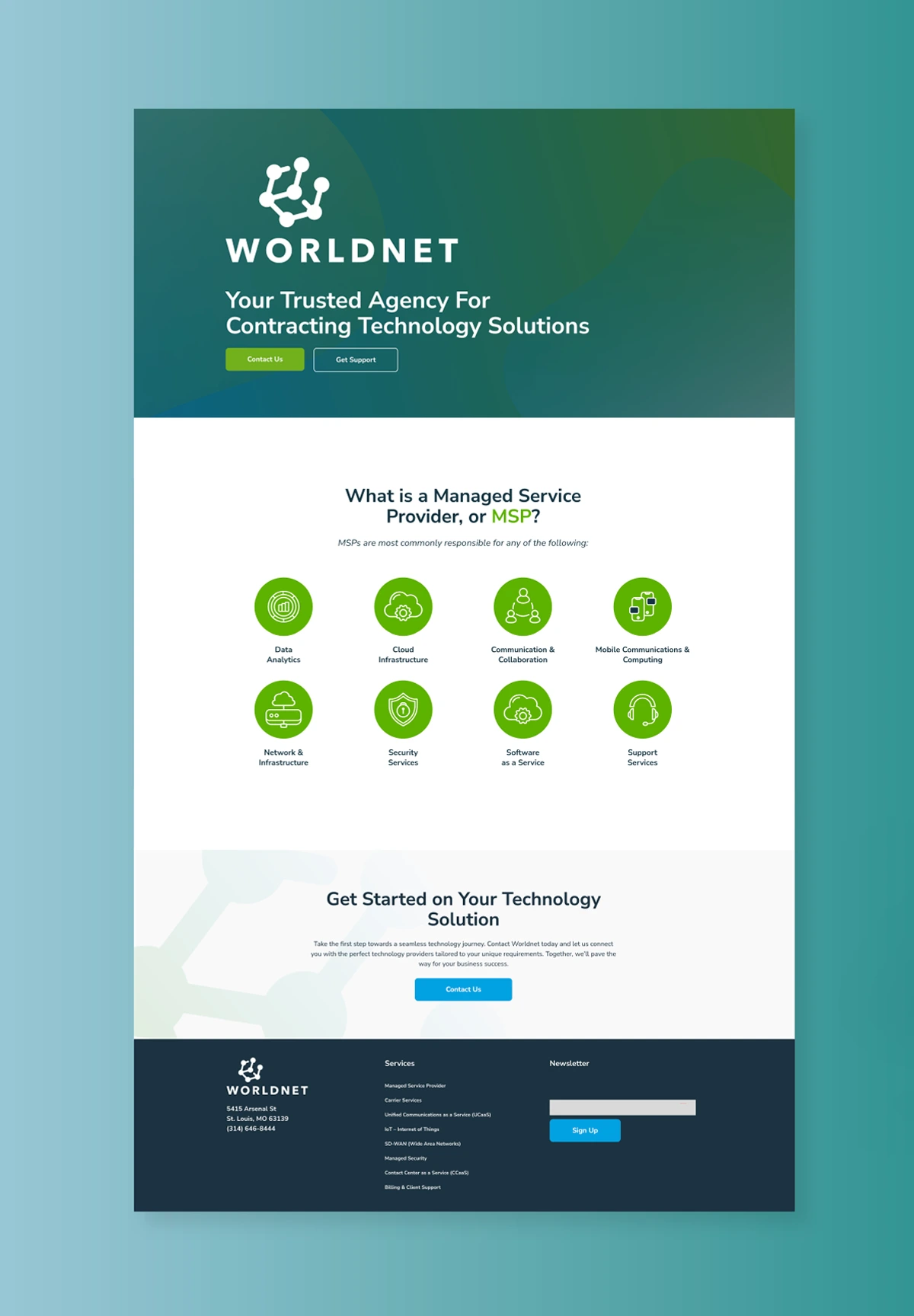
The Approach & Solution 

Seafoam recognized the importance of balancing content quality with engaging design. Our team worked closely with WorldNet Solutions to restructure their service pages, transforming walls of text into visually appealing, easily digestible sections. By introducing a light background, rounded edges, and abstract shapes, we created a contemporary look and feel that complemented WorldNet Solutions' commitment to cutting-edge solutions.

To further elevate their brand identity, Seafoam proposed the addition of an accent color. After careful consideration and collaboration, WorldNet Solutions chose green to harmonize with their existing blue and grey palette. This strategic design decision not only modernized their visual presence but also reinforced their brand's friendliness and approachability.

Throughout the redesign process, Seafoam prioritized clear information architecture and intuitive navigation. By grouping and displaying content in a user-centric manner, we ensured that visitors could quickly access the information they needed without feeling overwhelmed. This streamlined approach empowered WorldNet Solutions to showcase their expertise while providing a seamless user experience.

The Results 

The website redesign by Seafoam transformed WorldNet Solutions' online presence into a modern, inviting destination that accurately reflects their industry leadership and customer focus. Key results included:
A clean, visually engaging design that balances content and aesthetics
Improved user experience through clear navigation and content organization
Enhanced brand identity with the strategic integration of an accent color
Increased user engagement and time spent on service pages
Positive feedback from clients and prospects on the site's updated look and feel
A laptop displaying a webpage titled "Why Use a Managed Service Provider?" The page includes text about using a managed service provider and features an image of people having a meeting in an office setting.

Contact Us 

We love doing good things here. All it takes to get your business 'on the map' is a conversation with Seafoam.
Let's Go
magic-wandeyebubbleclocklist linkedin facebook pinterest youtube rss twitter instagram facebook-blank rss-blank linkedin-blank pinterest youtube twitter instagram