The best design work usually starts with a question that has nothing to do with design.
For nCase Technologies, that question was deceptively simple: how do you sell a product that most people don’t know they need — and that serves audiences with wildly different motivations for buying it?
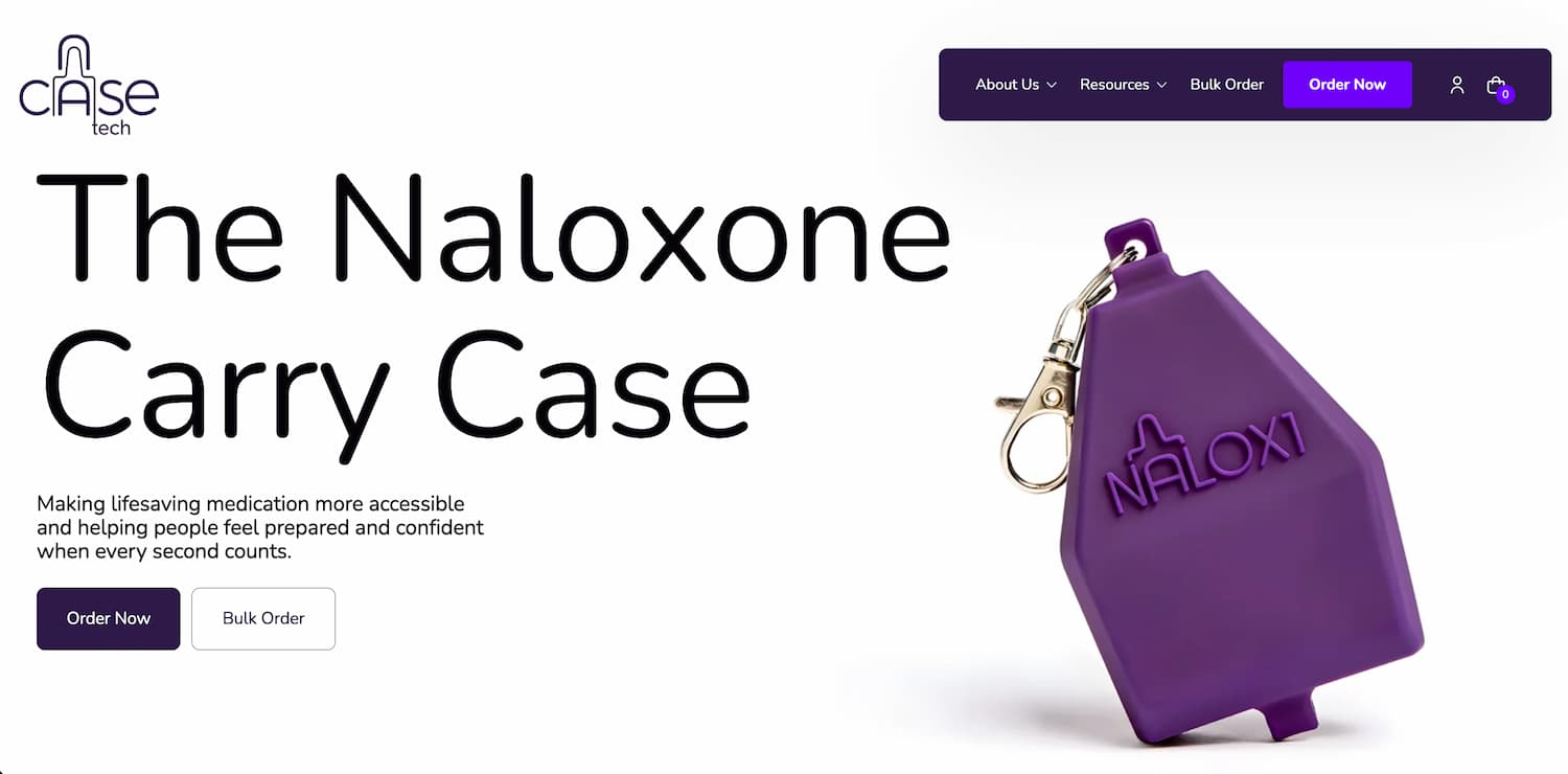
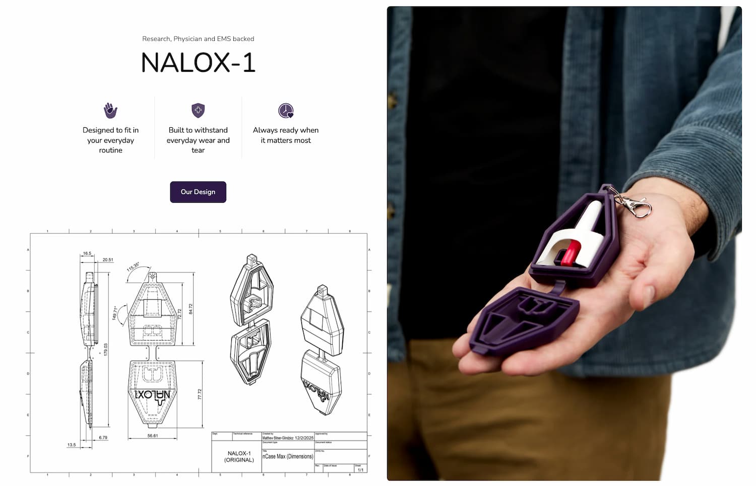
nCase makes a naloxone carry case called NALOX-1. It’s a compact, durable case designed to make carrying naloxone (the medication that reverses opioid overdoses) a normal, everyday thing. The product was born out of real loss and real experience — the founders witnessed an overdose and later lost a friend to one, despite naloxone being available in both cases. The problem wasn’t access. It was readiness.
That distinction matters. And it shaped everything we built.
We’re proud to share that our ecommerce redesign for nCase Technologies has been recognized with a 2026 GDUSA American Digital Design Award — an honor that reflects not just what the site looks like, but the thinking underneath it.
Where We Started
When nCase came to us, they had a Shopify site. It functioned. You could buy the product. But the site treated every visitor the same way, regardless of whether they were a college student who’d never heard of naloxone, an EMS professional looking to outfit a team, or a public health program evaluating a bulk order.
The purchase flow had friction. The mission — which is genuinely compelling — wasn’t landing clearly. And the various paths to conversion were tangled together rather than defined.
In short: the product was excellent. The digital experience wasn’t keeping up.
The Journey Mapping Process
Before we touched a single wireframe, we mapped the territory.
We started with customer persona development across nCase’s four core audiences: individual consumers, first responders and EMS professionals, universities and institutions, and public health organizations running harm reduction programs. Each of these groups comes to the site with different levels of awareness, different buying triggers, and very different definitions of what “conversion” looks like. An individual might need to understand what naloxone even is before they’ll consider carrying it. A university procurement officer just needs pricing, specs, and a bulk order form.
From there, we mapped the full buyer journey for each persona — from initial awareness through purchase (or inquiry, in the case of institutional buyers). This is where the real insights surfaced. We could see where the existing site was losing people: where the story wasn’t connecting, where the navigation assumed too much knowledge, and where the conversion paths were creating unnecessary friction.
The UX and conversion path optimization followed naturally. Once you can see where people get stuck, the design decisions become much clearer. We weren’t guessing at what to build. We were responding to what the research told us.
What We Built
The redesigned site does a few things the old one didn’t.
It tells the story first. Before asking anyone to buy, the site establishes what nCase is, why it exists, and why carrying naloxone matters. The statistics are sobering — 90% of people who own naloxone don’t carry it, and overdose deaths have surged over 170% in the last decade. That context isn’t just content. It’s the emotional and logical foundation for the entire purchase decision.
It creates distinct experiences for distinct audiences. Individual buyers get a clear path from education to product to checkout. Institutional buyers get a dedicated bulk order flow. The resources section serves everyone — from first-time visitors learning to recognize an overdose to healthcare professionals looking for research data.
It reduces friction everywhere it can. The product page is clean and direct. The FAQ addresses the most common hesitations (no, nCase doesn’t come with naloxone — but here’s where to get it for free). The “Buy One. Donate One.” program is prominently featured, turning a purchase into something that feels bigger than a transaction.
And it respects the weight of the subject matter. This isn’t a typical ecommerce play. People arrive at this site because someone they know is at risk, because they work in a field where overdoses happen, or because they’ve experienced loss themselves. The design reflects that — it’s clean, confident, and empathetic without being heavy-handed.
Why This One Matters to Us
We’ve been fortunate to have our web design work recognized by GDUSA before. It’s always an honor, and it never gets old. But this project carries a different kind of weight.
nCase was founded by people who experienced the gap between having a lifesaving tool and having it with you when it mattered. Seafoam’s job was to make sure that story — and the product built from it — reached the right people in the right way. Journey mapping gave us the framework. The redesign gave it a home.
The 2026 GDUSA American Digital Design Awards recognize the power of design to enhance online and interactive experiences, selected from thousands of entries across the country. We’re grateful to be among this year’s winners, and even more grateful to the nCase team for trusting us with work that genuinely matters.
Great design should do more than look good. Sometimes it should help save a life.